Vibrant Color Trends and Palettes for 2026 Weddings to Inspire Your Big Day
- Anette & Miguel

- Feb 28
- 3 min read
Choosing the right colors can transform a wedding from ordinary to unforgettable. In 2026, couples are embracing bold, lively hues that express personality and create memorable atmospheres. Whether you want a joyful celebration or a serene, elegant affair, the color palette sets the tone. This guide explores the latest wedding color trends for 2026, offering inspiration for brides and tips on selecting and combining colors to reflect your unique style and vision.

Trending Color Palettes for 2026 Weddings
The color trends for 2026 move beyond pastels and neutrals, focusing on rich, saturated tones that bring energy and warmth. Here are some palettes gaining popularity:
Coral and Teal
This pairing combines the warmth of coral with the coolness of teal, creating a balanced yet vibrant look. It works well for beach or garden weddings, adding a tropical and fresh vibe.
Mustard Yellow and Deep Plum
Mustard yellow adds a sunny, vintage feel, while deep plum brings sophistication. This palette suits autumn weddings or venues with rustic charm.
Emerald Green and Blush Pink
Emerald green offers a lush, natural feel, and blush pink softens it with romance. This combination fits elegant, classic weddings with a modern twist.
Electric Blue and Bright Orange
For couples who want to make a bold statement, electric blue paired with bright orange creates a dynamic, energetic atmosphere. Ideal for urban or contemporary weddings.
Soft Lavender and Sage Green
This palette is calming and fresh, perfect for spring weddings or outdoor ceremonies. It blends subtlety with a touch of color.
Inspiration for Brides: Matching Colors to Wedding Moods and Themes
Colors influence the mood of your wedding day. Here’s how to align your palette with different themes and feelings:
Romantic and Dreamy
Soft shades like blush, lavender, and sage create a delicate, romantic atmosphere. Use these colors in floral arrangements, bridesmaid dresses, and table linens. Incorporate textures like lace and chiffon to enhance the dreamy effect.
Bold and Festive
If you want a lively celebration, choose bright, contrasting colors such as coral and teal or electric blue and orange. These colors energize the space and encourage a fun, upbeat vibe. Use colorful lighting and bold décor elements to amplify the effect.
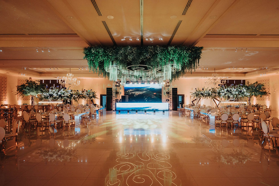
Elegant and Timeless
Deep hues like emerald, plum, and navy paired with metallic accents (gold, copper) create a luxurious feel. These colors work well in formal venues like ballrooms or historic estates. Choose classic floral arrangements and sophisticated table settings to complement the palette.
Natural and Earthy
Colors inspired by nature, such as mustard yellow, olive green, and terracotta, fit rustic or outdoor weddings. Use natural materials like wood, burlap, and stone to enhance the earthy theme. This palette feels warm and inviting.
How to Choose Color Swatches That Reflect Your Style and Vision
Selecting the right colors starts with understanding your personal style and the atmosphere you want to create. Follow these steps:
Gather Inspiration
Collect images from magazines, Pinterest boards, or real weddings that catch your eye. Look for common colors or moods.
Consider the Venue and Season
The location and time of year influence which colors will look best. For example, jewel tones shine in winter, while pastels suit spring.
Think About Your Wardrobe
Your dress and bridesmaids’ attire should harmonize with the palette. Consider how colors complement skin tones and fabric textures.
Test Swatches in Different Lights
Colors can look different indoors and outdoors or under natural and artificial light. View swatches in the actual venue if possible.
Limit the Number of Colors
Stick to two or three main colors and one or two accent shades. This keeps the look cohesive and avoids overwhelming the senses.
Tips for Combining Colors to Create a Cohesive Look
Mixing colors successfully requires balance and attention to detail. Here are practical tips:
Use a Color Wheel
Choose colors that are complementary (opposite on the wheel) or analogous (next to each other) for harmony.
Balance Warm and Cool Tones
Pair warm colors like coral or mustard with cool tones like teal or lavender to create contrast without clashing.
Incorporate Neutrals
Whites, creams, grays, or soft browns can ground bright colors and provide visual rest.
Repeat Colors in Different Elements
Use your chosen colors in flowers, linens, stationery, and even food presentation to unify the design.
Consider Texture and Pattern
Mixing solid colors with subtle patterns or different textures adds depth without breaking the color flow.
Use Metallic Accents
Gold, silver, or copper details can highlight your palette and add elegance.

Comments